(Firstly, thanks to everyone who took the survey. I had over 200 responses.)
I’m now analyzing the data that came back from my survey. It’s a lot to sort through–twenty questions times over 200 respondents can’t be written out onto post-it notes.
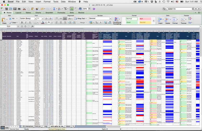
I’ve got a little preliminary analysis. Each scenario had a question asking the survey-taker to rate the concept from 0 to 6, with 0 being “much less desirable” and 6 being “much more desirable.” (A neutral response therefore would be 3.)
Each scenario had a customer point of view version and an employee point of view version. The customer point of view scenarios asked,
Please think of a time when you recently shopped in a store like this. How does the above scenario compare to your own experience?
and the employee point of view scenarios asked,
How well do the tools this salesperson uses help to make them better at their job?
Here’s how they were rated, on average:

They’re in order with the highest-rated customer point of view scenario on top. (A full list of the scenarios is here, or you’re welcome to click through and answer the survey.)
